GREEN MOUNTAIN MAPLE CANDY
Academic
A premium brand identity and packaging system inspired by Vermont's maple heritage, blending handcrafted tradition with a fresh, contemporary aesthetic.
MY ROLE
Graphic Designer
INDUSTRY
Food & Beverage
DURATION
3 weeks
FOCUS
Brand Strategy, Packaging Design, Brand Identity Package, Logo, Business Card, Letterhead, Envelope
DELIVERABLES
Logo Design
Packaging Design
Stationery
Business Card
Brand Guidelines
Presentation
Mockups
SOFTWARE
Illustrator
Photoshop
overview
Green Mountain Maple Candy was developed as a complete brand identity and packaging system for a premium maple confectionery company inspired by the traditions and natural beauty of Vermont.
The objective was to create a modern yet authentic visual identity that would communicate craftsmanship, quality, and freshness while standing out in the specialty food market.
The project included logo design, brand identity development, packaging design, stationery, marketing collateral, and presentation materials.
Every design decision, from typography and color palette to packaging structure and product imagery, was carefully crafted to create a cohesive brand experience that reflects both heritage and contemporary appeal.
challenge
Develop a premium brand identity and packaging system that celebrates Vermont's maple heritage while communicating authenticity, craftsmanship, and freshness through a cohesive contemporary visual identity.
creative process
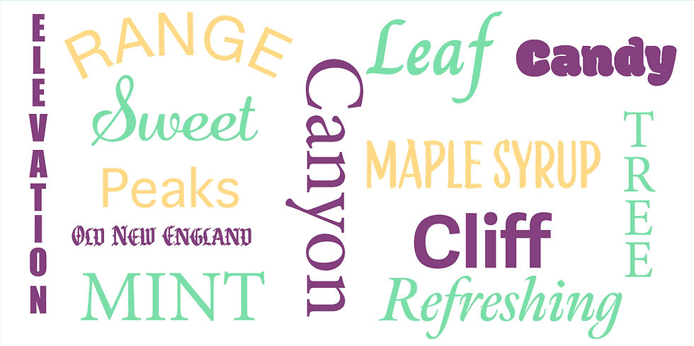
The research phase explored Vermont's natural landscapes, handcrafted confectionery, maple syrup traditions, fresh mint flavors, and premium consumer brands. These insights informed every visual decision throughout the identity system.
More than 40 thumbnail sketches, logo iterations, typography studies, and layout explorations were created before refining the final brand identity. This iterative process ensured every design decision supported the project's objectives.


final
solution
The final visual identity balances Vermont heritage with a clean, contemporary aesthetic.
The system includes a flexible logo suite, carefully curated color palette, typography, and supporting brand visual elements designed to create a cohesive experience across every customer touchpoint.
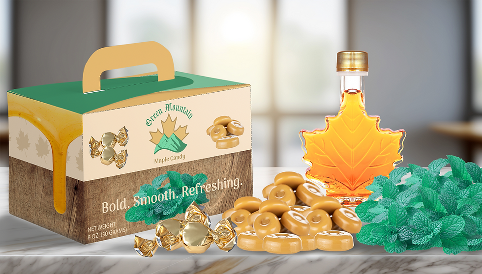
The final packaging system combines handcrafted textures, premium typography, and a warm color palette to create a memorable unboxing experience inspired by Vermont's maple heritage.
Brand Identity Design Solution

Package Design Solution


Stationery Design Solution


final
reflection
Green Mountain Maple Candy successfully evolved from an initial concept into a cohesive brand identity and packaging system. By combining thoughtful research, strategic design decisions, and consistent visual execution, the project demonstrates how branding extends beyond a logo to create a complete customer experience.